Thursday, April 28, 2016

Blue Fern Studios April Challenge


Hello Everyone!

I think i found the previous challenge over at Blue Fern Studios so much fun that i decided to enter this next one as well. Here is the sketch of April:


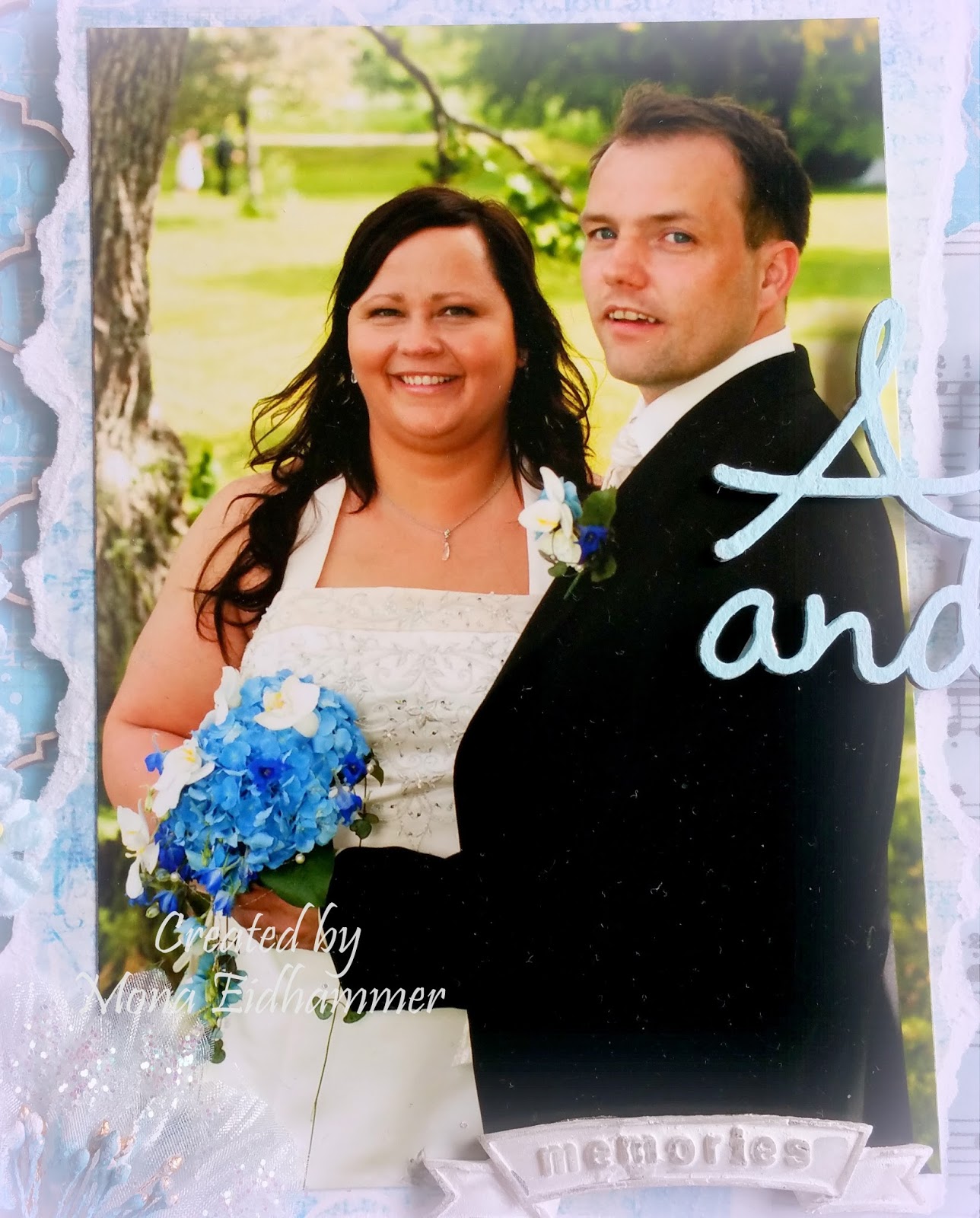
And here is my take on the sketch:


I was challenged in using a sertain colour combo in this layout. Usually i use 3 or maybe 4 main colours in my creations but i was given 5 colours to incorporate in this layout. These are: Light pink, light blue, light peach, light green allmost mint-ìsh and lavender. Not exactly colours i usually combine so this was a real challenge for me. The most difficult part was to find the right colour green since i sometimes mistakes it for beeing the colour light blue, depending on the lighting. Pretty annoying if you ask me, lol. 

Well anyway...i started gessoing the whole paper to prep it for the wet colour later on. Next i added some texture using a stencil and some modelling paste. I also painted the chipboard pieces and gave them two coates of Distress Medium Creasing. 


After everything had dried i started mounting all the elements i had picked out. 
I followed the sketch pretty close though. 


I just love this butterfly. I have had it for ages. Don`t remember which company though. A bit senile you see, lol. 


The text is a rub-on. Thought it would go nicely with this LO.


Don`t know if i managed to catch it on camera but i have used clear wink of stella brush on all my flowers to make them look shimmery. I think it has such a beautiful effect on the items covered with it.


All the chippies are from Blue Fern Studios. I just looove their designs. 


To finish off the layout i used some pink H2O paint, blended into a thin transparent colour. I then added it around the photo in random places. Also put some onto the stenciled background as well. I just had to be careful so i didn`t get the other papers wet. I think it turned out pretty well. I hope you like it as well.

This will be entered into the Blue Fern Studios April Challenge

Thanks for visiting me today.

Thursday, March 31, 2016

Blue Fern Studios Challenge

Hello Everyone!

For the first time i`m entering a layout challenge. I haven`t created many layouts. Can count them all on one hand, lol. As the deadline for this challenge is i the middle of the night for me, i had some poor light to take pics in. I will take some new ones in the morning. So i`m only posting this one, just so i could manage to enter the challenge in time.

UPDATE:
Below i have posted some new pics and a little description on how i went about it.


Here is the sketch we are working from.


I have to warn you though. This is a picture heavy post, lol.


I started prepping my paper from Blue Fern Studios of course (Petit moments from the Frolic collection), with a thin layer of gesso. Next i used modelling paste with stencils from Prima and The Crafters Workshop randomly placed. I then spritzed it with sprays from Lindy`s Stamp Gang and Ranger.


After everything had dried up i stamped with a text stamp randomly placed. I primed the chipboard with gesso and when dry i spritzed with Perfect pearls Blue Smoke and Distress paint Weathered Wood. I also used Long John`s Silver moonshaddow mist with a brush and painted some areas with it. Allmost every scrapper has probabely tons of scrap paper we can`t afford to throw away in case of later use. Well.... i have lots!!! and now i got to use some lol. I glued on some strips of scrap paper along with some corrugated cardboard, a doily and one vintage ephemera card. Oh i allmost forgot, lol. I also sprinkled some white and black acrylic paint blended with water to make it thinner and easier to apply.


When all the groundwork was finished i started embellishing the whole thing. Chipboard pieces from Blue Fern Studios off course. Shabby Brick bits and Township collage.


Other supplies used:

Clear glass beads art engredients from Prima
A mix of dark blue, gold and copper microbeads
Wood clock piece, Flowers,and vintage trinkets, all from Prima
From my stash: Lace, organza flower, a tag, wood star, thread and a tag.
Bling from Prima and Staz


Some more closeups following.


It took me some time since i actually have no idea what i`m doing, lol. That`s how it is when i overthink things. Anyone suffering from the same problem, huh? I have turned to Anna Rogalska`s creations for inspiration. Love her work.

Well, i hope you are still hanging on, lol. It got to be a long post. Not so often i do that. Hopefully it made some sense to you. If not, don`t hesitate to ask. I will try and answer as best as i can.

Now i only have to wish you a great weekend.

Challenge entered - Blue Fern Studios

Sunday, January 31, 2016

12 Tags of 2016 - January

Hi everyone!

Hope you all are enjoying your weekend. I however have decided to particiate in the 12 tags of 2016 by Tim Holtz. This is the first time i`m entering these tags challenges. I am so excited.


This first one is a Technique remix from earlier projects by Tim. Links to these techniques is provided in Tim`s post.


And here is my take on the project.


I was a bit unsure of how i could pull this off, as my inventory of embossing folders are rather slim, lol. I only own 3 pieces as embossingfolders haven`t been a passion of mine. Two of these were absolutely not suitable for this project so i just had to go for an old one from Marianne Design. I was actually going to get rid of it but now i`m happy i didn`t, hahaha.


Another problem i had, was chalk. Absolutely non-existant in this household. So what to do? Well i cheated a bit. Instead of the chalk technique i used white embossingpowder and a white colouring pencil to achieve the same look. 


Well, I was at least satisfied with the end result and i had a lot of fun doing it, Hope you like it as well.


Supplies i have used:

Metal tape from my local hardware store.
White colouring pencil from Lyra.
Black and white acrylic paints

Thanks for visiting me today.

Saturday, January 23, 2016

Mixed media tags

Hello everyone!

Just popping in to show you a couple of tags i created before Christmas. I suddenly remembered i had forgotten to post them, lol. Senile is a bitch, hahaha.


I used the same technique for both tags. Started off with a stencile and some texture paste. On the purple one i used a cogs stencile.  


I embellished it with a honeycomb from Blue Fern Studios and a wood veneer piece. Not sure what company it is as i got it in a candy long ago. But i think it might be Kaisercraft. Please correct me if i`m wrong. I also used metal pieces randomly placed here and there. Finally i gessoed the whole thing and then spritzed it with colours from Lindy`s Stamp Gang. For finishing touch-ups i put on some bling, some micro beads and a cute ribbon.


For this next tag i started off like the one above, with stencile and texture paste. I then spritzed with my own homemade shimmering sprays. I used distress inks blended with perfect pearls and water. I`m just sorry i didn`t manage to catch the shimmer on camera but i can assure you it looks fabulous. Absolute love the bright yellow colour.


I embellished with some chipboard pieces covered with embossing powder from Lindy`s Stamp Gang. Love the two-toned colour. It`s dark brown with gold shimmer, but it allmost look black. As i didn`t want to cover up too much of the awesome background i just stringed around some jute and a metal flower. To finish it off i put on some bling, text and ribbon. 


I hope you all are having a great wekend. I`m just winding down as this week has been truly exhausting. Just watching some movies with my hubby and just do absolutely nothing. Can it get any better? 

Thanks for visiting me today.


Wednesday, January 6, 2016

Kit and Clowder Christmas card swap

Happy New Year everyone!

 I just want to tell you about this amazing lady....Alyce from Kit and Clowder. She is leading this facebook-group of the most amazing girls. It is so great to be a part of this community.  There is allways some backing up no matter what you struggle with and they allways cheer on you if you have great things going on. 

She is also doing online colouring classes. And i just have to say they really makes a difference in your colouring technique. If you want to check it out you can find it here

It`s not only colouring we do. There is bingo weekend every first weekend of the month, there are challenges, there is a book club for those who want to join in. And lots more. Among one of the things we do is swapping stuff, lol. And the card below is the one i entered in this last years Christmas card swap. 

I had to restart colouring 3-4 times as i managed to muck things up. I guess you can understand the relief i felt when i finally finished the image without any huge flaws, lol. It`s been a while since i coloured and my confidence is not on top i`m afraid. Anyway...here it is.


This card was sent to Chris Neal across the big pond to USA. I hope she liked it.


Thursday, December 17, 2015

My first ATCs

Hi everyone! 

I`ve tried something i`ve never done before....ATCs. For those of you that don`t know what an ATC is. ATC stands for Artist Trading Card. These are sized 2 1/2 x 3 1/2 inch. They may seem small but this size is set because they are supposed to fit into the standard card collector pockets.

A little while ago i entered a small challenge on Facebook where we were given a recipe on how to go ahead creating these ATCs. I never thought i`d pull it off but i made it, lol. And i had so much fun as well. So this is something i want to try out more. Hope you like them.


I started off with 4 different heavy designpapers. I painted them with gesso blended in water to get at more transparent look just to tone down the pattern of the paper. 


Next i took some silk paper and stamped it randomly with several stamps. I then crinkled it up and glued it onto the paper sheets. 


For the last steps i first put on some tissue tape and then stamped it with a background stamp. Last step before embellishing was spritzing them with sprays from Lindy`s stamp gang. 


Finally the cards were ready to get embellished. I cut out some vintage images from a cuttingsheet from Kort & Godt and put on some text stickers from Authentique. And some other small embellies.


I actually like how they turned out. So i`m definately going to try this again soon. I`m sorry i didn`t get to catch the shimmer of the colours. Daylight here is quite poor on this time of year. But i can asure you the shimmer looks fabulous! 

Thanks for taking the time to visit me. Allways love visits.


Sunday, November 8, 2015

Father`s day

Hi everyone!

Today we are celebrating father`s day here in Norway, and in that regard my hubby asked me if i could create a card for him to give to his father. Of course i couldn`t say no to my sweet guy, så here it is.


I think this must be the fastest card i have ever made, but i really am satisfied with how it turned out. My hubby needed a card with a pocket to put a lotteryticket into, so this is what i created. I have seen these types of cards online before and found out it was a perfect card to use. I had to use my own measurements though, as the ticket didn`t have the same size as a giftcard. But the principle is the same. The tutorial i found here.


To decorate the card i used a piece of watercolour paper and used distress ink with a blendingtool and spritzing water to make it blend. Then i used spray inks with perfect pearls, which i have blended myself to get the shimmery parts. Finally i distressed the edges and inked them up.
The butterfly i got in a prize pack i received so i`m not sure what company it`s from but it might be Prima. The rub-on is from Staz.

Hope the explanation was understandable. I`m not the best tutor, lol.
Anyway....thanks for visiting me today!

Challenges entered:

TreL - Farsdag
Whimsy stamps Challenge - Fall colours or Christmas
Left of Centre Creative Challenges - Things with wings

Wednesday, October 28, 2015

WSBT round 2 - Layout category

Hi there!

Just popping in to share with you my last creation for round 2 in the World Scrap Battle and Tournament. It`s a layout of my wedding and i just have to warn you that this is a picture-heavy post.


As our wedding theme were light blue i decided to use that colour for my layout. I love how the pics turned out and we had so much fun shooting them.


The paper is Parisian Anthology collection from Pink Paislee. Love the resist in the paper which you will see on a couple of pics further down. I started with Art Basics modelling paste from Prima using the burlap stencil by Tim Holtz and the moroccon lattice stencil from KaiserKraft. When dry, i used Broken china distress ink to frame the area of the photo. Next i spritzed with Blue Hawaiian blue from Lindy`Stamp Gang.


I then watered down some white and some black acrylic paint to make it thinner, and dripped it on the paper. I also dripped the blue from Lindy`s as well. The heart is Prima, Amore aqua coll. and the rose is WOC.


This Resin rose element from Prima was a bit ruined but i figured i could still use it. I painted the middle of the big flower (Meredith dove from Prima) to get rid of the "wrong" colour and gave the big rose (Arcadian coll. from Prima) some stickles diamond glitter. The memories element is also from Prima.


The Always and forever chipboard text is from Blue fern studios. I have painted it with some light blue acrylic paint and adhered it with some dimentional pillows. 


I and my amazing husband. 


Below are a couple of closeups, of the gorgeous shimmer from the sprays by Lindy`s. And you can also see the resist in the paper as i mentioned earlier. I just sprayed the mist and then used a damp cloth to dry it off, and the letters came forward as i never had sprayed them. Awesome, don`t you think?


I`m opleased with how this LO turned out. I still have lots to learn. But it is so much fun creating layouts. 


Hope you like this as much as i do. Thanks for visiting me today.

Related Posts with Thumbnails