Showing posts with label Layout. Show all posts

Monday, April 17, 2017

A new creation....actually

Hi there everyone!

I`ve actually got a NEW creation in store for you today. It`s a mixed media layout of my eldest daughter. She was in a bit of a crazy, funny mood when she took this selfie. Of course i had to use this for my layout as i thought it was kinda cool. 

I started off with some modelling paste and a checker stencil. Next i used a stencil with numbers and some viva decor copper paste. For the spraying i used sprays from Lindy`s Stamp Gang. The final stencil i used is the leafy one, which i combined with distress ink, spiced marmelade.


When all the mediums had dried i stamped some text and a poststamp in random order. For the final touch on the background i used a cap of one of the spray bottles to "stamp" small circles of white gesso randomly. When finished with the background i started prepping the metal. I coated the metal with white gesso and then painted them with blue metallic blended with black, for the right shade.


Next task was to emboss the chipboardpieces. I have used embossingpowder from Lindy`s and Stampendous. I just love the blue shimmery colour of the arrow/feather piece. It doesn`t show too good on this pic but i promise it`s lovely.


I thought the sentiment was a bit describing for the mood in which the pic was taken, so i just had to use it. This piece was embossed with enamel from Stampendous. Here i have used Ivory. I just love the gold specs in it. 


The photo was matted with a designpaper and a white paper using chipboard to make a more layered effect. I also added some playingcards just for the fun of it.


For some last finishing touches i have added a few flowers, some metal stars and some bling. And then splattered with black and white gesso as well as the two colours used on the background. 

That`s it for this time. Hope to see you back here soon.


Thursday, December 8, 2016

Colourful and simple

Hi everyone!

Today i`ve been home with a massive headache. It felt like my head was going to explode. But now i`m starting to feel a bit better. So here i`m sitting all alone in the darkness, thinking i have some blogging of old stuff to do, lol. Well i`m not the fastest to blog my creations but i hope you`ll bare with me anyway.

Last year i attended a crop with Irit Landgraf as one of the teachers. Amazing lady. So soft and delicate in her presence. I emediately took a liking to her.

With that said, i want to show you the two layouts i created during her class. They are not exactly my "style" but i really like how they turned out. And it made me want to try out this style some more. Hope you like them.


All papers and embellishments are from The Hip Kit Club which is one of the design teams Irit is a part of. I love the combination of colours and design of the papers. 


.I just adore this pic of my youngest daughter. The photographer really caught the essence of her. She allways has a smile ready for anyone. She is strong minded and also know how to charm anyone, lol. I`m afraid she`s gonna become a heartbreaker when she grows up, lol. This pic is about 5-6 years old.


Irit also explained the prosess of blending the colours without mucking them up. And i really like how they acted on the paper. We used watercolour paper as a backround using distress inks to blend.


This next LO is showing how you can use your scraps and still manage to create something great with them. This one is quite simple but i think i pulled it off. 


This pic was taken for her first day at school. And it is about 2 and a half years old. You can see she still has that lovely smile. My little baby sweetheart is growing older so fast. 

Thanks for joining me today. See you soon.


Sunday, October 2, 2016

Autumn layout

Hello peeps!

I`m back with a layout i created a while back. I suddenly realized that i hadn`t blogget it. It was one of my projects for an application to the Blue Fern Studios Designteam. I didn`t make the team though but i had lots of fun creating this one.


Fall is my favourite time of the year. There are so many fantastic colours. Just love it. And on this layout i have really enjoyed creating with all these different colours. The photo is of my eldest dayghter at her first day at school. Now she`s 18 years old. I wonder where the time went?


I have used colours from Lindy`s stamp gang. As it is a while since i created this, i`m so sorry to say that i don`t remember which colours i used. I usually write down all the colours i use, but it seems i have lost the note for this LO.


The paper is from Blue Fern Studios as well as the chipboard pieces.


I have used stencils from Prima and i have used green metallic modelling paste with sandgrains. It has a fantastic shimmer that i didn`t manage to catch on camera. You just have to take my word for it, lol.


I particularly love how this little birdie turned out.


I`m so pleased with the colour combo. Just love the rustic feel of the details. 


Just look at these wonderful fall colours on the chippie piece. 

Well....once again i got a bit overboard on the piccies, lol. I REALLY have to get better on that department, hahaha. Hope you are still with me though.

Thanks for visiting me today. Until next time.....

Thursday, April 28, 2016

Blue Fern Studios April Challenge


Hello Everyone!

I think i found the previous challenge over at Blue Fern Studios so much fun that i decided to enter this next one as well. Here is the sketch of April:


And here is my take on the sketch:


I was challenged in using a sertain colour combo in this layout. Usually i use 3 or maybe 4 main colours in my creations but i was given 5 colours to incorporate in this layout. These are: Light pink, light blue, light peach, light green allmost mint-ìsh and lavender. Not exactly colours i usually combine so this was a real challenge for me. The most difficult part was to find the right colour green since i sometimes mistakes it for beeing the colour light blue, depending on the lighting. Pretty annoying if you ask me, lol. 

Well anyway...i started gessoing the whole paper to prep it for the wet colour later on. Next i added some texture using a stencil and some modelling paste. I also painted the chipboard pieces and gave them two coates of Distress Medium Creasing. 
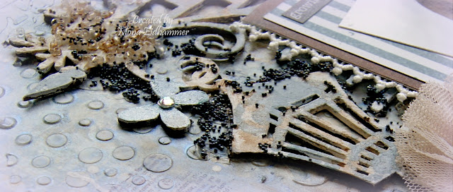

After everything had dried i started mounting all the elements i had picked out. 
I followed the sketch pretty close though. 


I just love this butterfly. I have had it for ages. Don`t remember which company though. A bit senile you see, lol. 


The text is a rub-on. Thought it would go nicely with this LO.


Don`t know if i managed to catch it on camera but i have used clear wink of stella brush on all my flowers to make them look shimmery. I think it has such a beautiful effect on the items covered with it.


All the chippies are from Blue Fern Studios. I just looove their designs. 


To finish off the layout i used some pink H2O paint, blended into a thin transparent colour. I then added it around the photo in random places. Also put some onto the stenciled background as well. I just had to be careful so i didn`t get the other papers wet. I think it turned out pretty well. I hope you like it as well.

This will be entered into the Blue Fern Studios April Challenge

Thanks for visiting me today.

Thursday, March 31, 2016

Blue Fern Studios Challenge

Hello Everyone!

For the first time i`m entering a layout challenge. I haven`t created many layouts. Can count them all on one hand, lol. As the deadline for this challenge is i the middle of the night for me, i had some poor light to take pics in. I will take some new ones in the morning. So i`m only posting this one, just so i could manage to enter the challenge in time.

UPDATE:
Below i have posted some new pics and a little description on how i went about it.


Here is the sketch we are working from.


I have to warn you though. This is a picture heavy post, lol.


I started prepping my paper from Blue Fern Studios of course (Petit moments from the Frolic collection), with a thin layer of gesso. Next i used modelling paste with stencils from Prima and The Crafters Workshop randomly placed. I then spritzed it with sprays from Lindy`s Stamp Gang and Ranger.


After everything had dried up i stamped with a text stamp randomly placed. I primed the chipboard with gesso and when dry i spritzed with Perfect pearls Blue Smoke and Distress paint Weathered Wood. I also used Long John`s Silver moonshaddow mist with a brush and painted some areas with it. Allmost every scrapper has probabely tons of scrap paper we can`t afford to throw away in case of later use. Well.... i have lots!!! and now i got to use some lol. I glued on some strips of scrap paper along with some corrugated cardboard, a doily and one vintage ephemera card. Oh i allmost forgot, lol. I also sprinkled some white and black acrylic paint blended with water to make it thinner and easier to apply.


When all the groundwork was finished i started embellishing the whole thing. Chipboard pieces from Blue Fern Studios off course. Shabby Brick bits and Township collage.


Other supplies used:

Clear glass beads art engredients from Prima
A mix of dark blue, gold and copper microbeads
Wood clock piece, Flowers,and vintage trinkets, all from Prima
From my stash: Lace, organza flower, a tag, wood star, thread and a tag.
Bling from Prima and Staz


Some more closeups following.


It took me some time since i actually have no idea what i`m doing, lol. That`s how it is when i overthink things. Anyone suffering from the same problem, huh? I have turned to Anna Rogalska`s creations for inspiration. Love her work.

Well, i hope you are still hanging on, lol. It got to be a long post. Not so often i do that. Hopefully it made some sense to you. If not, don`t hesitate to ask. I will try and answer as best as i can.

Now i only have to wish you a great weekend.

Challenge entered - Blue Fern Studios

Wednesday, October 28, 2015

WSBT round 2 - Layout category

Hi there!

Just popping in to share with you my last creation for round 2 in the World Scrap Battle and Tournament. It`s a layout of my wedding and i just have to warn you that this is a picture-heavy post.


As our wedding theme were light blue i decided to use that colour for my layout. I love how the pics turned out and we had so much fun shooting them.


The paper is Parisian Anthology collection from Pink Paislee. Love the resist in the paper which you will see on a couple of pics further down. I started with Art Basics modelling paste from Prima using the burlap stencil by Tim Holtz and the moroccon lattice stencil from KaiserKraft. When dry, i used Broken china distress ink to frame the area of the photo. Next i spritzed with Blue Hawaiian blue from Lindy`Stamp Gang.


I then watered down some white and some black acrylic paint to make it thinner, and dripped it on the paper. I also dripped the blue from Lindy`s as well. The heart is Prima, Amore aqua coll. and the rose is WOC.


This Resin rose element from Prima was a bit ruined but i figured i could still use it. I painted the middle of the big flower (Meredith dove from Prima) to get rid of the "wrong" colour and gave the big rose (Arcadian coll. from Prima) some stickles diamond glitter. The memories element is also from Prima.


The Always and forever chipboard text is from Blue fern studios. I have painted it with some light blue acrylic paint and adhered it with some dimentional pillows. 


I and my amazing husband. 


Below are a couple of closeups, of the gorgeous shimmer from the sprays by Lindy`s. And you can also see the resist in the paper as i mentioned earlier. I just sprayed the mist and then used a damp cloth to dry it off, and the letters came forward as i never had sprayed them. Awesome, don`t you think?


I`m opleased with how this LO turned out. I still have lots to learn. But it is so much fun creating layouts. 


Hope you like this as much as i do. Thanks for visiting me today.

Related Posts with Thumbnails